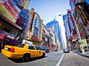
The Power of Color and Images: Famous Commercial Banners and Ads

The word banner is not only associated with beautifully designed printed advertisements but it also a term that refers to the banners we see on the web. In fact, web banners have been around since the mid-nineties, as the internet was taking off and people often think they are an antiquated form of advertisements on the web.
Google studies have shown that cross-screen banner ads can drive brand lift and accounted for 82 percent of the unique reach of tier-one campaigns. This is because the visual appeal of a well-designed banner can make impressions on consumers, more so than any complex display formats like video. The same goes for beautifully printed banners. Here at Universal Graphics, we understand the power of the banner and thought we’d talk a little bit about what we can do with this medium.
Banners are an effective way to catch people’s attention but also to sear a brand into a person’s mind through the power of images and crafty language or catchphrases. After all, one great design can significantly affect your bottom line.
Advice on Effective Marketing Banners — Less is More
The success of any marketing campaign— online or print or both— essentially comes down to quality and creativity. Three main principles to keep in mind when creating a successful banner campaign might include:
- Compel your audience. You have to attract attention so they must be visually appealing. It must follow the conventions of good design and maybe even think outside the box a little to stand out. You want to compel, stand out, be unique.
- Be concise. You don’t need long explanations or parentheticals or disclaimers. There is no time for that in the day-to-day world. A person might catch a glimpse of your ad for only a second so you want to explain yourself and make your case in that amount of time.
- Be clear. What good is a great image and boldness if the message is not clear or doesn’t translate. Don’t try to say too much, lest you clutter it unnecessarily. Communicate one single message clearly.
Let’s start with a few successful banners you might recognize from previous marketing campaigns.
The Science Behind Some of the Best Work
In addition to the above-mentioned principles, there are some more focused in considerations to help you reign in your design. These are:
Finding the key to the visual appeal
Once you know your message and what you want to convey, think of new approaches or unique ways to think of this idea visually.
Image-To-Text-Ratio
And while the visuals are of high importance, you want your banner ad to have some text. Billboard designers, for example, try to keep their designs to 6 words or fewer. Of course, there is no hard rule—it’s largely a creative design so you can play around with it.
Colors
The psychology of colors is an everyday go-to with advertisers and display ad designers. Choosing your colors carefully will go a long way.
Call to Action
Many times a good ad, you want to call your audience to action and propel them to do something or make a decision. Think about how you can get your audience to move or make a move towards your product within your design itself.
Examples of Effective Banners That Compel and Impress
On any given day, every big company or corporation is looking for a way to reach more people or ensure that the efforts they are putting forth are reaching the people they’re supposed to reach. If you’re a local business in the El Paso area, you might be trying to reach more people in the city or a nation-wide audience. Either way, we can help you through creative and professional design services. Let’s take a look at some good examples.
Nike: Just Do It
Nike has been as successful as anyone in producing instantly recognizable ads and banners. The catchphrase is both concise and clear at the same time that it is apt for the kind of audience they go for: typically athletes or people seeking some kind of challenge. In that sense, wherever Nike goes, their tagline follows and it works in a variety of levels. It’s minimalist and to the point.
Got Milk Campaign
During the late 90s and early 2000s, the Got Milk campaign was created by the American advertising agency, Goodby Silverstein & Partners, and launched nationwide in order to try to get people to buy more milk. This saw celebrities of all walks of Hollywood—from Whoopi Golberg to Harrison Ford to famous athletes like Patrick Ewing—sporting a milk mustache and advertising the importance of the drink for health.
So what do the two examples above have in common?
They both follow the principles of clarity and conciseness but also compel the audience in some way. Nike’s entire tagline is a call to action.
Get Your Next Banner with Universal Graphics
There are endless creative ways to make an effective and compelling advertising banner. The important thing is to keep your message at the forefront and work with unique ways to convey that message in a small amount of space. Here at Universal Graphics, we can help you get started with your next banner ad design.

